Humanity Direct
→
Changing lives for the better
WEB DESIGN / ART DIRECTION

The original site design
The site was dated. The brand colours were bright and distracting. The colour palette had nice tones, they just needed to be utilised better. The typeface that was used across the pages was difficult to read and the fact that it was available in title case only didn’t help.

Mapping the new site
It was clear that three specific points needed to be addressed in the new site structure.
There needed to be clear signposting throughout especially to fundraising , donating and charity history.
The user needed information on how to fundraise (as they were previously calling the charity for this information).
They needed to celebrate the impact that these donations have made so far, so that more users can see the difference this charity can continue to make.
Due to client budget, it was decided that a plugin designed specifically for the charity sector was to be used to manage payments
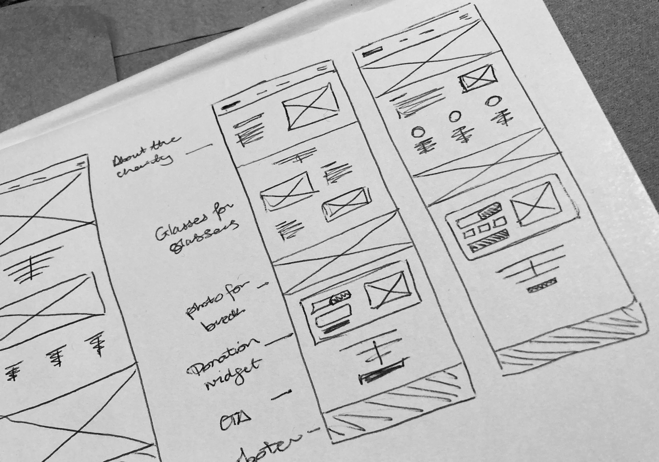
Sketching the initial pages
Once the site map was established and the additional pages worked in the user journey, sketching the wireframes began.
This process was important, as we needed to factor in how the user would interact with the patient page and where we needed to introduce more informative content on each page. For instance, the user’s attention needed to be focused when performing tasks, such as donating or signing up to become a fundraiser.
It was important that the mobile screens were considered at this stage, as this was the first stage of visualisation.
Creating low-fidelity wireframes
Once the initial sketches were amended and reviewed, it was time to move on to creating wireframes on screen.
These were used to walk the client through each stage. The screens were prototyped and annotated for the client to review after the meeting in their own time.

UI styling / illustrations
It was important that the colour palette would work harmoniously with the content. It was essential that the charity kept the warmth and friendliness that it had. The colour palette was expanded to feature tints of the yellow and teal colours for use across the pages. The bright orange was used to draw the eye to important information such as CTAs.
An important factor in this UI stage was finding a typeface that could be both modern and friendly without losing character. Through trial and error, DM Sans was picked for use.
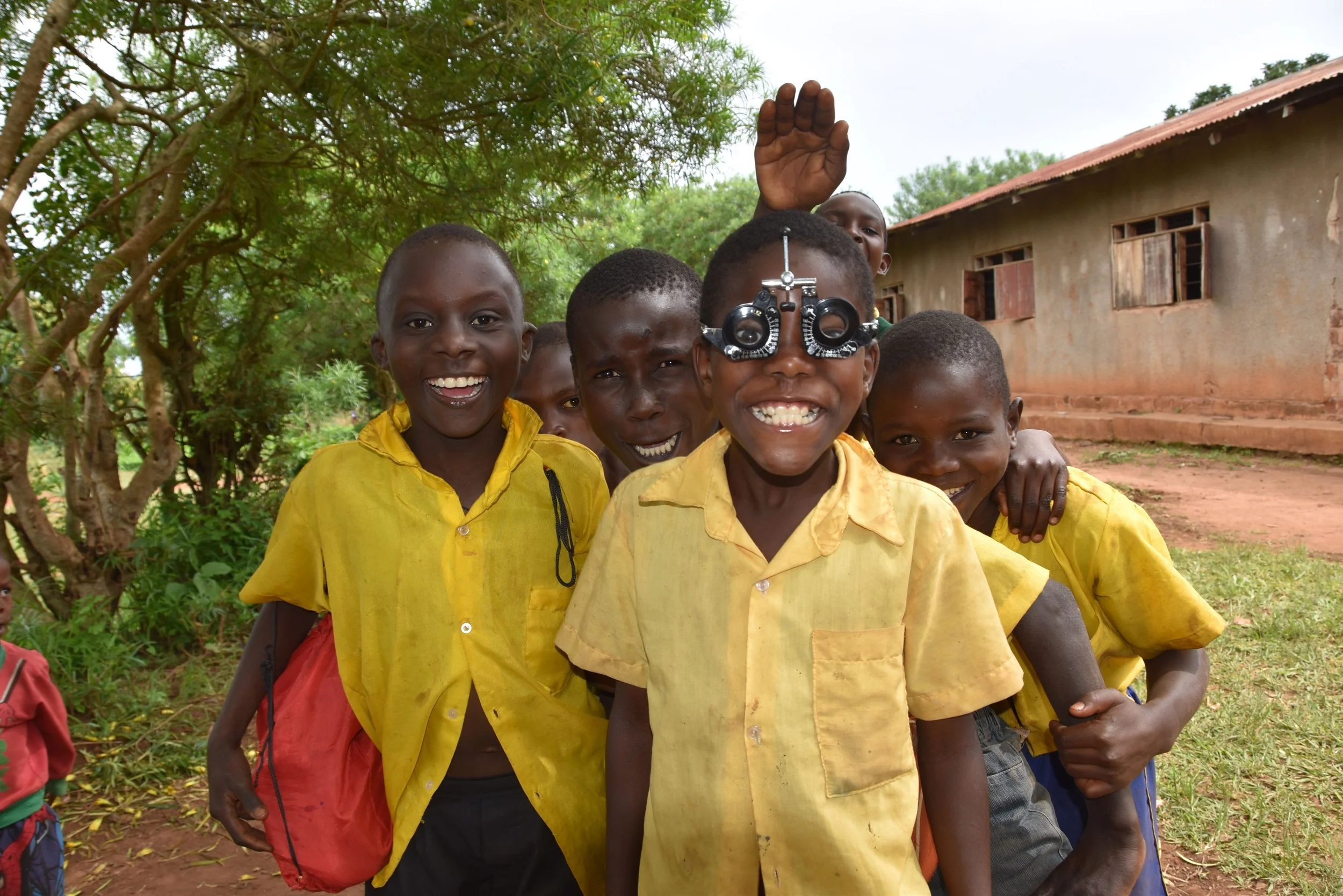
Incorporating real-life images throughout this site was essential to emphasise the authenticity of this charity. Illustrations were also used sparingly where a single photograph would not suffice.
Putting it all together
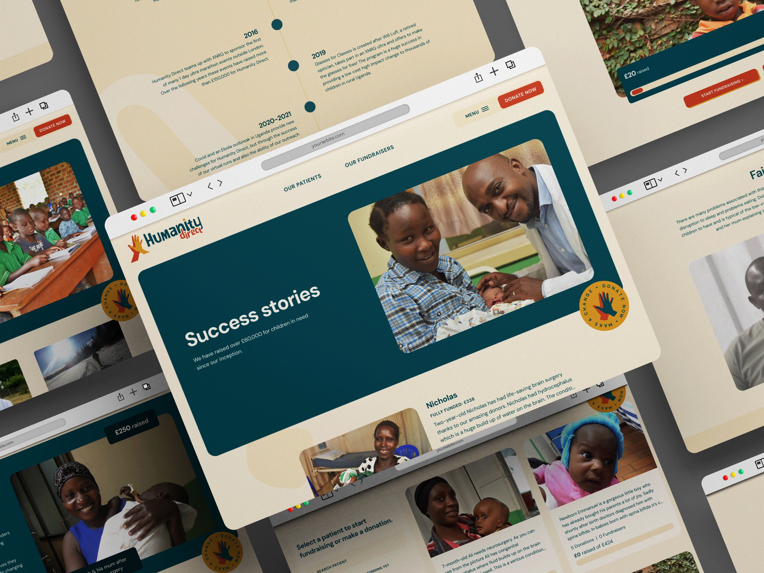
The final design is a friendly and informative charity site. It highlights the need for funding while still celebrating all of their achievements.
The illustrations and softer colour palette is a more appropriate tone for a children’s charity. The bolder colours in the palette are used more sparingly to highlight, not dominate.
The user journeys focus on providing information to fundraisers and donors, creating a more seamless experience.


