Compare + Invest
→
Short -term advice for long term goals
WEB DESIGN / ART DIRECTION

The Project
→
Compare+Invest - rebrand and website
A rebranding project for Compare the Platform (CTP), a site which offers investment platform comparison ‘calculators’ and general information on investments.
Their primary users are professional financial institutions and professional financial advisors, but they wanted to pivot their business and audience to target public consumers. This audience is made up of 20+ year olds who are looking for investment info and comparing different investment platforms.
The website and overall brand needed to be refreshed and updated to target this new and younger audience.
The original site
The brand needed a refresh to suit the audience it wanted to target.
The site used jargon unsuitable for the novice investor. It also was difficult to understand where to find information, so the layout of content needed to be considered also.
The site also felt dated and unappealing to the audience of mainly mobile-first generation of 20+ year olds.
The task
The site needed to cater to the audience of new investors, as well as ensure the professional advisers were not alienated or excluded.
The rebrand
Separate into 2 versions - consumer and advisor
The structure
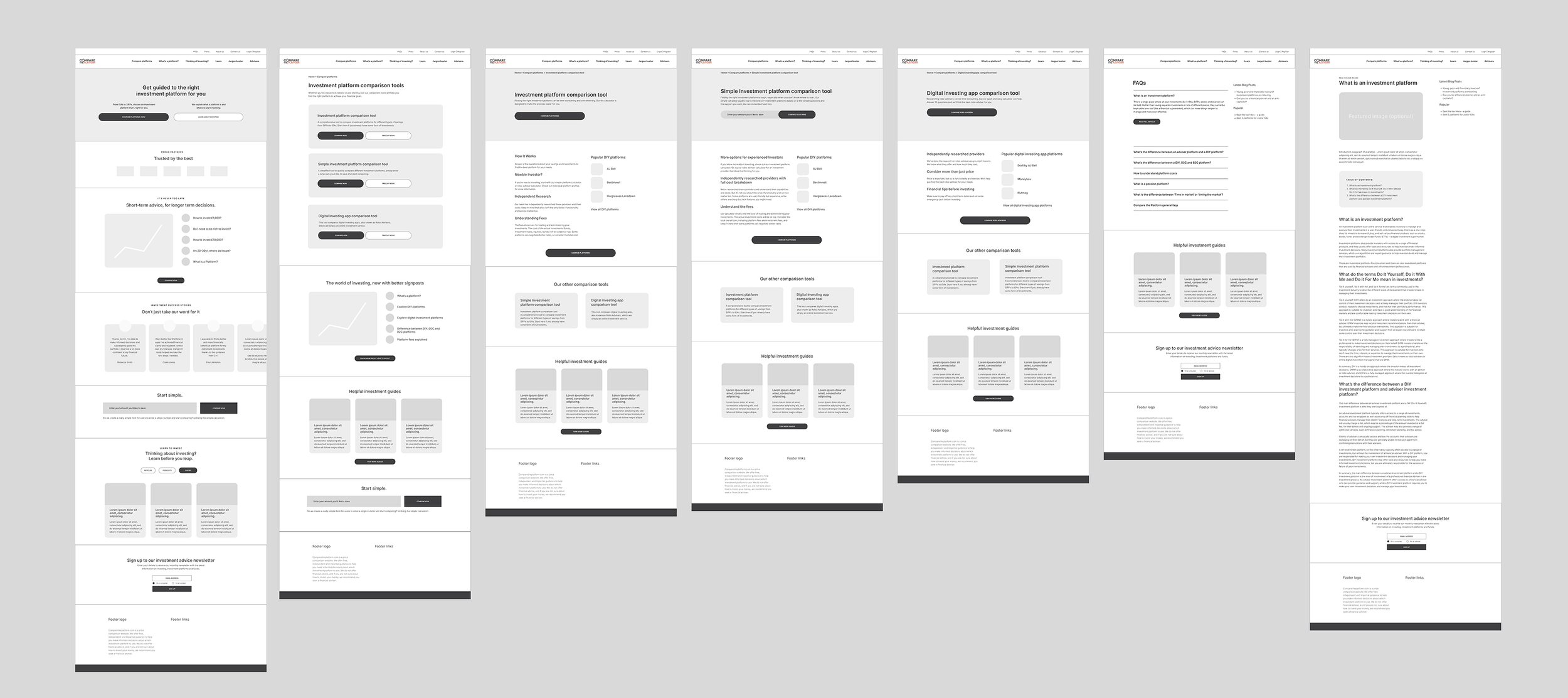
Once the initial layouts were decided upon, the design could move on screen. Simple black and white wireframes laid out the design intention, and customer journeys were tested before moving on.
Making sure users could find educational content was an important part of the process, and the layout and copy used evolved over time to reflect the shift in user needs.

Developing the site
Considerations for UI could be taken into account once the layout was improved and tested. A library of images and symbols representing both investment terms and life goals was created.
The initial colour palette of oranges and greys was finely tuned to now be both dark and light greens. This symbolised the young vibrant investors beginning their journey as well as well seasoned and matured investors. The colour palette was expanded into tones of greens to aid with the website rollout.


